Fallen
Date: November 2018
Size: H 60 x W 90 cm
Media: metal on board
Colour: primarily red and black with gold, silver, blue
Price: £145
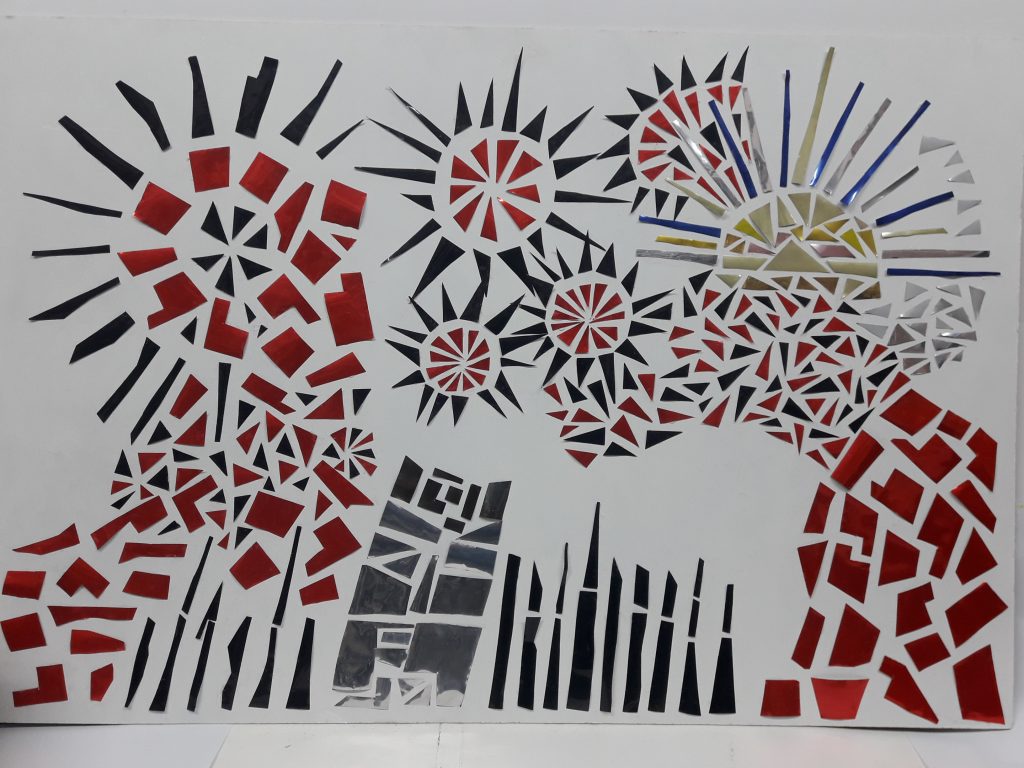
Description: this is the 6th work of “canart” and an attempt to produce a work with a vision in mind (rather than organically as with “Sphinx”) and on a larger scale.
As the work was started in November and coincided with the 100 years anniversary of the First World War the aim was to convey a battle scene with “fallen” soldiers. Echoing the symbolism of poppies the predominant colour used was red with black to convey the threat and evil of war.
As the first world war was probably the first industrial war symbols of mechanical warfare were utilised. An exception to this was the use of “warmer” colours top right. This aim here was to represent the rising sun (and hope, normality …) being obliterated by the power of man’s warlike capabilities.
The circular features represent explosions or could be interpreted as mechanical “cogs” of war destroying of grinding up all around them with the resulting red and black symbols “falling” to the earth. The black “spikey” symbols represent trench warfare, weaponry or even denuded trees. The silver block aims to convey the use of weaponry such as the huge field guns again reinforcing the industrial nature of warfare.
Having completed the work there is a robotic quality about the right-hand section which adds to the mechanical war theme. The black and red colour theme emphasises the militaristic theme with echoes of uniform regalia etc.
However viewers of the work have interpreted the symbols as flowers or the style as Japanese!
Self satisfaction score: 7/10 A progression of “canart” in that a theme was created and developed to conclusion, although as always the work developed in a different way than originally intended, e.g. the large “star” shape on the left was a late idea. I believe the piece is striking in colour and shape although the sinister message and destruction conveyed is somewhat disturbing. I am not convinced by the harmony of the multi-coloured “sun” image with the main body of black and red.
Top Tip: The predominant use of just two colours adds the the visual appeal in this case and the subject matter rather than being a deficiency.